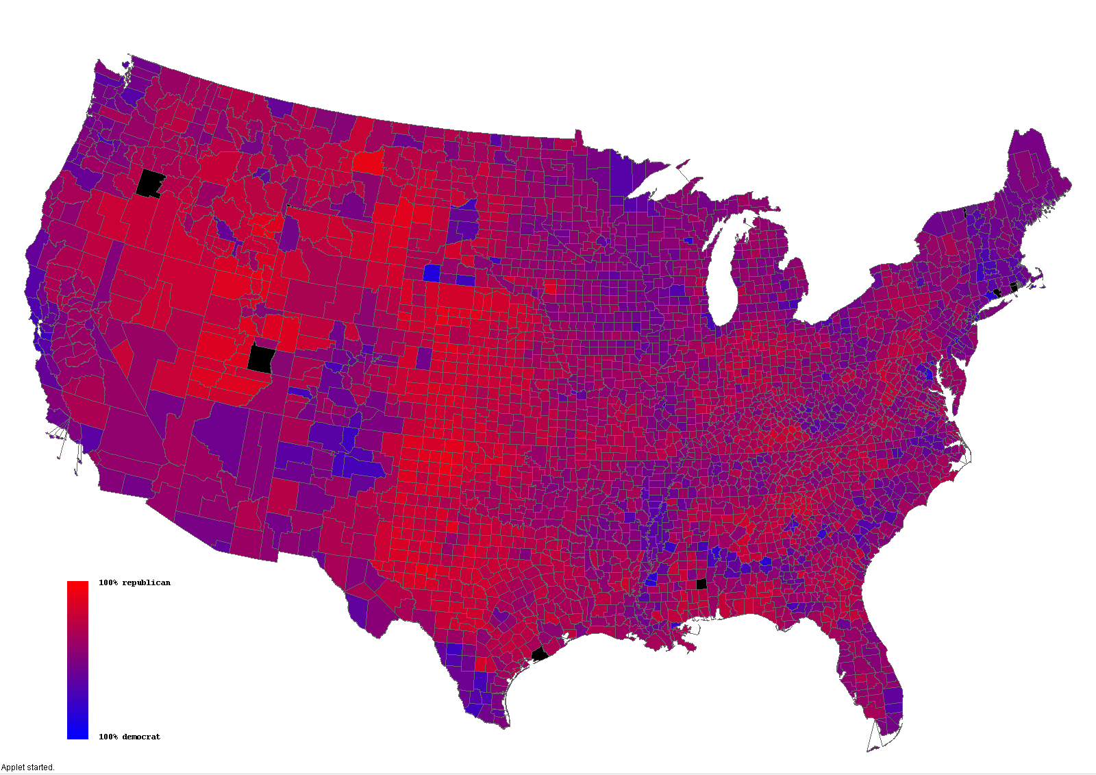
I recently posted maps showing both state-by-state and county-by-county red/blue maps. The validity of the maps was challenged by a reader in the comments for the post. While I don't exactly agree with the position the reader took, I did comment that it would be interesting to see results not in bipolar red and blue, but in varying shared of purple, the result of mixing red and blue in varying amounts to show the distribution of the votes.
Well here we go - lots of additional maps from Michael Gastner, Cosma Shalizi, and Mark Newman at the University of Michigan, purple variation maps from Robert Vanderbrei, and a cool 3D map from GIS/CBS News. Here's an animation of the 2004 vs. 2000 vote distribution - click it to get to the full-size image.

Member discussion: